Askaboutmoney Favicon Too Small

FWIW in Chrome I can use this to locally override the default favicon:
Maybe other browsers have similar options or extensions?

2023-08-05 14 55 10.png


Edit: Firefox seems to have something similar:
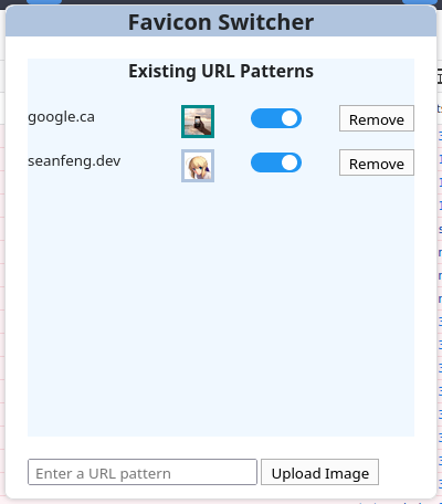
To be honest, I don't really pay much heed to the tab icons myself. Maybe others do?
 
Thanks Mathepac

That would be a good design for our A3 Poster.

1691246113203.png

Not sure it works as a favicon
1691246178729.png

It might be clearer than our current favicon
 
Last edited:
I don't think you can have three letters in a favicon and do much better than what we have at present.

So we would have to come up a symbol or logo instead of AAM

Some ideas
The Letter A Google uses G


a tickmark
1691248264917.png


A question mark
1691248316203.png


Something which conveys answers?

Something which conveys a forum?

1691248451737.png
 
Question, (about) Money, Answer, Ireland or some such and going round in circles conveys a forum. Not on AAM of course.

Q€A_LOGO.png
 
Heres one I did quickly in a favicon editor, I can't upload the ico.
Screenshot 2023-08-05 18.17.19.png
 
Last edited:
Agree with BB that 3 letters in a column won't be any clearer than in a row.

Reason is that the favicon space is square in format and capitals are usually taller than they are wide.

If you personally know a graphic designer but still pay him/her you will get the benefit of personal commitment - something vital to stimulating creative juices. Don't be afraid that such a person may come into your office one day and look for financial advice. That's possible and not out of order. But what would be out of order would be if they expected you to do your work for anything less than would be charged to another unknown client for the same work. Reason - you paid the graphic designer for his/her work.
 
Thanks Mathepac

That would be a good design for our A3 Poster.

View attachment 7728
Not sure it works as a favicon
View attachment 7729
It might be clearer than our current favicon

Out of curiosity where do you use a AAM A3 poster.

Do you even have a logo? Or any graphic design work done for the site/forum. If you don't whomever designs the favicon is kinda doing two jobs.
 
Last edited:
Agree with BB that 3 letters in a column won't be any clearer than in a row.

Reason is that the favicon space is square in format and capitals are usually taller than they are wide.

If you personally know a graphic designer but still pay him/her you will get the benefit of personal commitment - something vital to stimulating creative juices. Don't be afraid that such a person may come into your office one day and look for financial advice. That's possible and not out of order. But what would be out of order would be if they expected you to do your work for anything less than would be charged to another unknown client for the same work. Reason - you paid the graphic designer for his/her work.
I somehow doubt that @Brendan Burgess is going to hire a graphic design professional (or even an amateur) to design a custom favicon for Askaboutmoney...
 
A speech bubble with an A or a € in it might be good.

Might not look well in small scale
Brendan
That's a matter of contrast and anti-aliasing. Or sticking to certain angles like 45 to get sharp lines. That's how you do pixel art. You draw at large scale while previewing at the 1:1. You also have factor different resolutions etc. Personally I would make it a simple shape symbol rather than letters.
 
Thanks Mathepac

That would be a good design for our A3 Poster.

View attachment 7728
Not sure it works as a favicon
View attachment 7729
It might be clearer than our current favicon
A graphic is just a graphic of a particular type until you covert it to another type (e.g. PSD, SVG, PNG, JPG, ICO, etc) and/or a different size Favicons can be 8x8, 16x16, 32x32, etc, in other words, whatever suits its usage and visibility. Scalability with images and typefaces is now greater than it ever was before pixelation begins to occur. Vector graphics images support scalability as they are stored as mathematical models of the image.
 
A graphic is just a graphic of a particular type until you covert it to another type (e.g. PSD, SVG, PNG, JPG, ICO, etc) and/or a different size Favicons can be 8x8, 16x16, 32x32, etc, in other words, whatever suits its usage and visibility. Scalability with images and typefaces is now greater than it ever was before pixelation begins to occur. Vector graphics images support scalability as they are stored as mathematical models of the image.
Do many people really care that much about tiny images to go to all this trouble? I certainly don't.
 
It's not so much a question of size, but more one of readability and identifiability - the essence of getting the most from branding.

It has nothing to do with branding. To see the favicon, you already have the page open in your browser. If you have too many tabs open that's your own problem

But if it's really that important to change it, chrome pulls this image for recently opened tabs in the mobile app. I presume it is pulling it from the AAM website so maybe it is a simple change.

The single A on the AAM blue background is fairly recognisable and identifiable

Screenshot_20230806-115004.png
 
But if it's really that important to change it, chrome pulls this image for recently opened tabs in the mobile app. I presume it is pulling it from the AAM website so maybe it is a simple change.
Isn't it actually that Chrome, in the absence of anything more specific for a site, just creates such a generic icon using the first letter of the domain name?
 
Back
Top